Color Trends for 2019
If the warmer weather has you thinking about sprucing your house up, whether with a mini makeover or a full-blown remodel, it’s worth considering your color choices carefully. The palette you select for your house makes a world of difference to the overall look.
One good way to narrow down choices and get inspired is to investigate trends in interior decorating. In particular, it helps to examine popular color trends, so you know just what to ask for when searching for “interior painters near me” online. Here are some of the top color options for 2019 to date.

Natural Shades
Although colors inspired by nature have been big for a while now, this year we’re seeing more of a focus on the tones found in woodlands, rather than bright botanicals. Light shades such as mushroom grays are particularly popular and are a wonderful alternative to more traditional tans or beiges. Earthy mushrooms are a combination of gray blended with warm brown, and they provide a natural, more old-world vibe to a room.
Also keep an eye out for paints in neutrals that highlight maple, ash, or pine tones. These are perfect for people who like to avoid too much color in the home, but still allow color lovers to add oomph with bright furnishings and accessories.
Soft Pinks
A soft palette choice you’ll see more and more this year is that of pale pink. While once pink was reserved more for nurseries than elsewhere, things have changed. Today you’ll find it being used all over the house, including in bedrooms, laundries, bathrooms, and lounge rooms. Pale pinks are quite neutral and are compatible with many other shades. They can be mixed well with lots of crisp white in a room, or even soft lemon yellows.
Muted blushes and rosy pinks are rather timeless, however, if you’re not interested in using much of this color, add a pop of it to an otherwise clean, neutral room by choosing a soft pink vanity or cabinetry. Pinks of today are modern and sophisticated, yet warm and calming at the same time.
Uplifting Coral
As “Living Coral” is the Pantone Color of the Year for 2019, it’s no wonder that uplifting coral paints are all the rage this year. The hue gives an optimistic, energetic feel to spaces, and has both a golden undertone and a nice, soft edge. Coral tones are said to embody the human desire for joyful pursuits and comfort, and as such the color is suited to rooms where you and your family want to engage in lighthearted activities and creative, playful expression.
Muted Purple
In recent times, there has been a real revival of the use of purple in homes. Much of this probably stems from the fact that Pantone named “Ultra Violet” as the number one color for 2018. However, this year the trend is more for muted, understated purples. They still have plenty of richness and energy to them, but the current popular shades are those with more of a mellow intensity. This makes the hue more versatile, and it can be used anywhere from bedrooms and offices to living areas.
Moody Tones
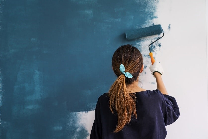
Similarly, other deep, saturated colors with a moody feel are having their day, too. Dark greens, charcoals, and navy paints work well in rooms with an abundance of natural light, and can help to give a real impact and draw the eye. These rich colors add personality and are perfect for kitchen cabinets and custom built-in features. They also add a stately look to entryways, powder rooms, and single accent walls.

Misty Blues
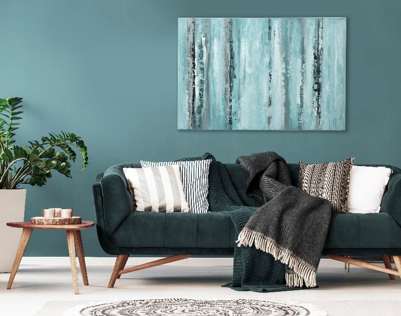
If you’re more interested in lighter paint colors, check out the range of beautiful misty blues that have been brought out by manufacturers this year. Look for a blue with a softened haze that has a calming gray undertone. This kind of shade promotes serenity and is just right for bedrooms or offices where you want to feel calmer and more in control.
Berry Reds
The idea of using red paint in the home has in the past been kept to a minimum, such as in accents or as a feature wall at most. However, that’s changing. 2019 is heralding the rebirth of red, in particular reds in bold, saturated shades such as berry reds. These options add life to a space but don’t tend to overwhelm it. Deep berry is also cozy and comforting, and energizing, too.
Choosing paint colors for your interior design can be rather intimidating with so many hues on the market, and trends coming and going over time. However, opt for any of the interesting, timeless kinds of shades mentioned above, and you’ll be not only “of the moment” in your choices, but also creating a look for your home that’s sure to stand the test of time.
shelly peterson says
I would love to paint an accent wall with a nice color in my living room.