We have a small living room with some big challenges in it. So many times, we’ve grabbed magazines or searched online for help decorating “difficult” spaces or small spaces and what we find is – well, not the same as our definition of small. It’s frustrating. We have my parents’ old (they’d had it for 2-3 years before my mom died and dad gave it to us) living room furniture, and while it’s great furniture, super comfortable and excellent quality, it’s way too big for the room and it’s just. not.working.
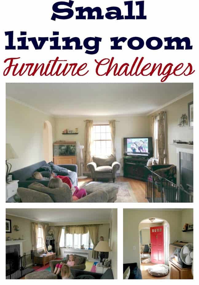
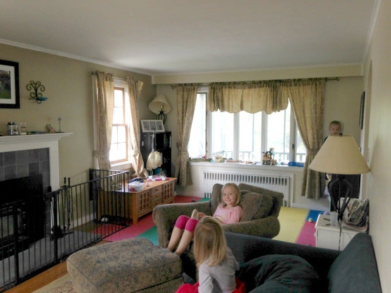
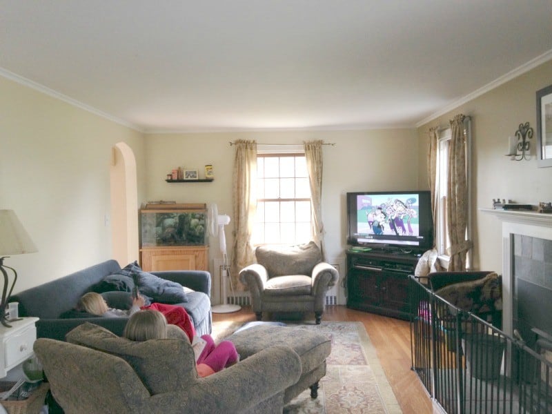
Here are some photos so you can see just what our obstacles are. Doorways, windows, radiators and a fireplace with surrounding gate all team up to give me a headache when trying to make something work in this room! As it is now, all 5 of us can’t sit together and watch a movie together unless we move furniture around or pile on top of one another.
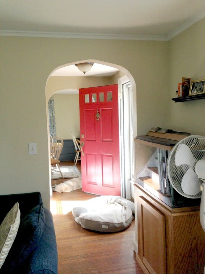
This is the first doorway into the living room. Notice how the couch is at the edge of the doorway. The fish tank may or may not stay where it is.
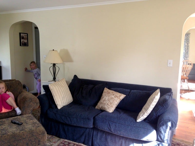
That’s the one wall we have that’s kind of usable. See how big the couch is? It’s enormous for the room. (Also super comfortable).
The back of the room is the “play area” — you can see the “bumpy floor” as we call it and the 923432432 Lego blocks and creations around. Also the fireplace gate. There’s just no space for the pieces we have and I’m ready for something more functional and also more deliberate.
Here’s the view from the bumpy floor. See how messy the room is? We’re human! My house is NOT perfect. You can also see just how the furniture does not fit in the space and how much we need help.
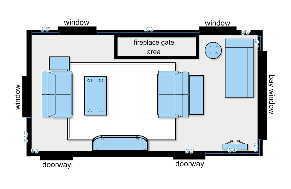
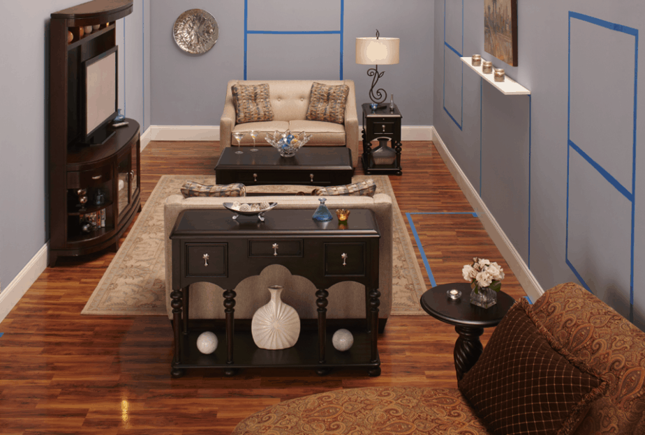
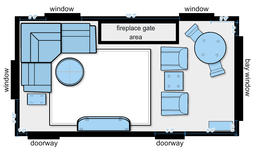
The nice folks at Raymour & Flanigan agreed that our small living room was a challenge, and gave us a really big surprise. They came up with not one, not two but 3 different options for the space! There IS hope for small living room furniture challenge rooms like our own!
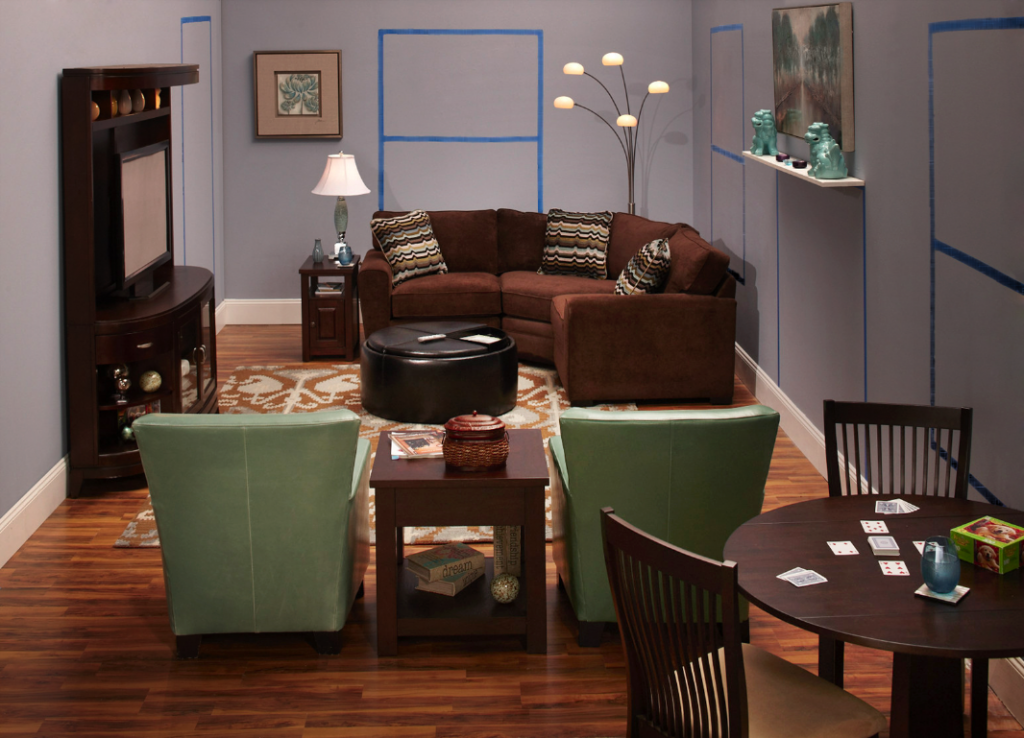
Option 1 Photo (Note the blue tape- those are from our measurements of our living room). This option is lovely but maybe too formal for our house with 3 little ones running around.
Option 2:
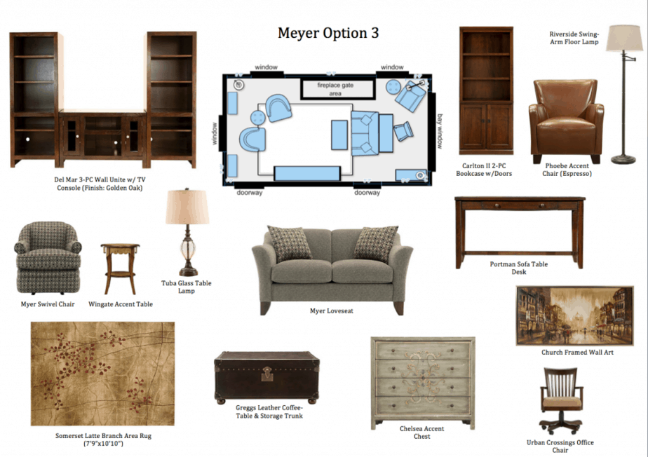 I love the pieces in this layout. The colors and lines are so pretty!
Option 3:
So I am curious- which of the 3 concepts would you choose for this space? Which do you think we’re going to go by?
Many, many thanks to Raymour & Flanigan for sponsoring today’s post and the gift card to make our new living room possible. We’ll be sharing the “after” in a few weeks!
Jenn @ The Rebel Chick says
I’d go with a combination of 2 and 3. Something that’s a mixture of both but lets all seats see the fireplace instead of just some.
Amanda @ Growing Up Madison says
Tough choice there but I think I love the first one a bit more. It can be tough decorating when you have limited space.
katrina g says
Those are great tips. I used to have such a small living room that it was a headache when it came to furniture.
Debbie Denny says
Love the options. I kind of like 3.
Liz Mays says
Since the room is probably a TV room, the last image seems to be most favorable for that kind of use. This is neat to see a visual representation of what it could be!
Mommy2jam ( Adrianne) says
I could really use a living room makeover. I love the options I couldn’t choose, I am so bad at these things.
Shanna says
We used to have a TINY living room in our old apartment, so I know your struggle! If I were choosing, I’d go with option 3!
Cynthia L says
I am going with option number two! it is so hard to decorate a small room. I think any option that your family is comfortable with is the best!
Robin (Masshole Mommy) says
I would definitely go for something comfortable, too! Especially with the kids.
Taralyn says
I need to have someone do this for my space! We just moved and I can’t decide how to place the furniture!
Janel (A Mom's Take) says
I really like option number 2. The furniture is so pretty. I can’t wait to get my furniture, but for now, we are waiting for our children to get a bit older.
Amber Edwards says
I know a lot about troubles with small rooms and big furniture. We have had that problem every house we live in! I absolutely love option 3!
Jennifer says
I love this concept of giving you three options to choose from. I feel like I’m reading about a show on HGTV. I would definitely go with option three. It seems to have the most floor space for three energetic kids.
susan says
What a great way to learn how to maximize a room, your room looks great! I will have to try this.
Kayla @ TheEclecticElement says
How really nice of them to give you all 3 options to choose from! All of them seem to utilize your difficult space to the fullest, too. I think I like option 2 the best but I can’t wait to see what you guys choose 🙂
Kelli Avery says
I personally like the last image. I like how the seating is angled more towards the TV seems unrealistic to face the opposite way of the tv as in the other two images. But all of the layouts are pretty cool for small space living!